Creative brief: create an engaging and relevant name and creative treatment for a bimonthly Menards channel publication. Within this client ask, naming conventions needed to reflect the publication’s purpose in a simple and straightforward way; entice sales associates to explore content; relate to the Menards' position as the “hometown hardware store,” as well as not conflicting with similar existing publications.
Solution:

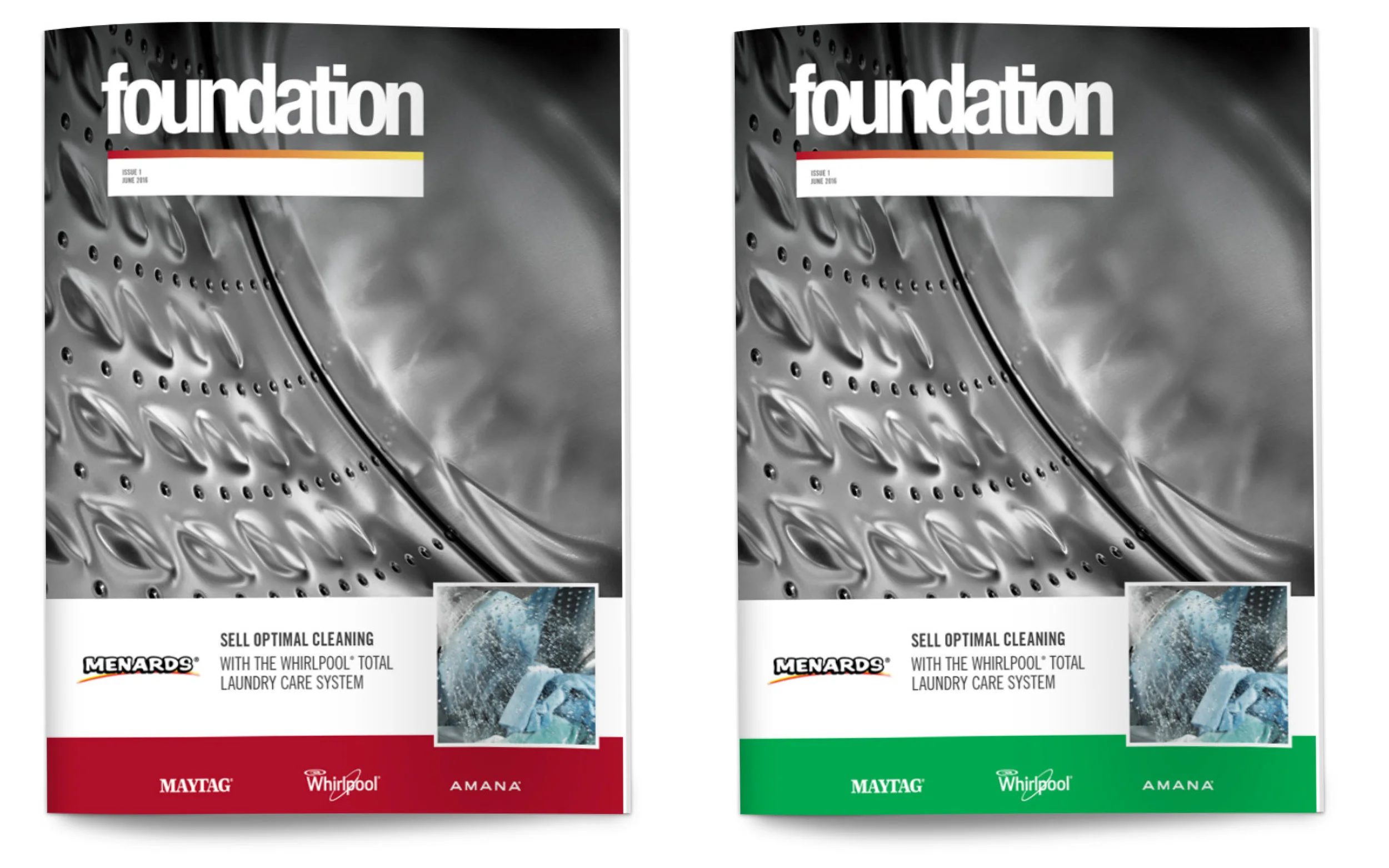
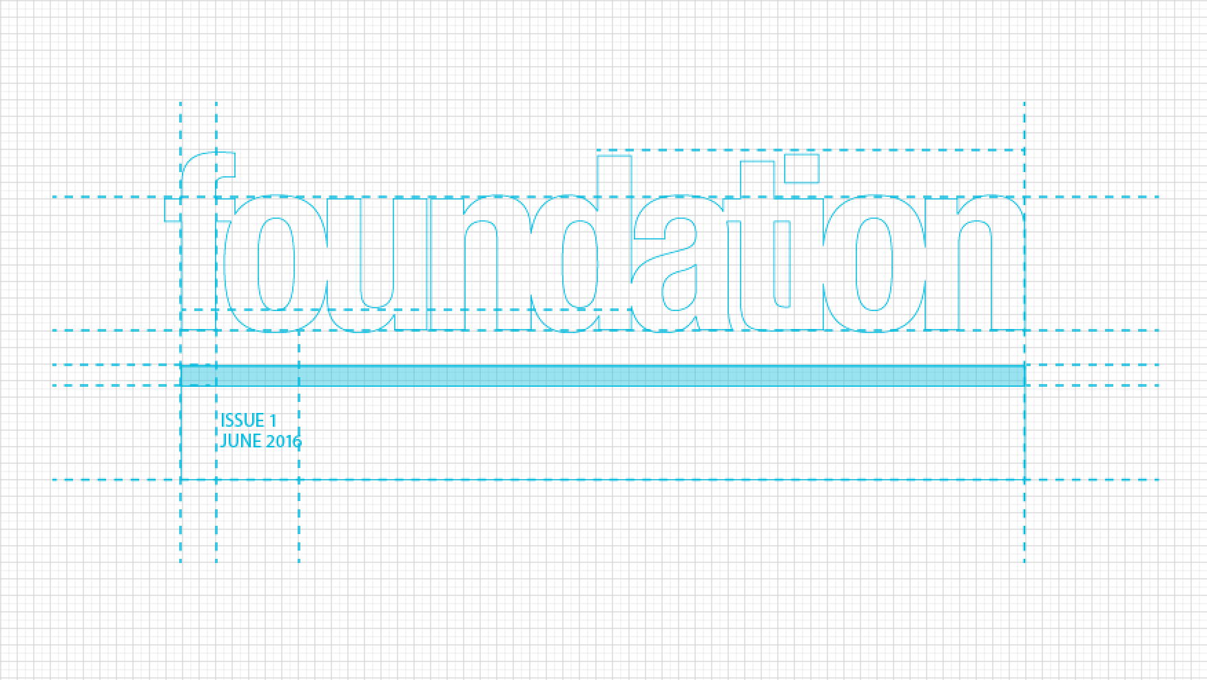
Rationale behind "foundation" as a naming/title solution: Foundation is a simple and straightforward term relating to the publication’s baseline of product knowledge and sales tactics for associates to build upon
Supporting definitions include: a structure that supports a building from underneath; an idea, principle or fact that provides support for something.
Creative Treatment: The thick bar beneath the letterforms creates a physical foundation on which the publication name builds.The weight of the font implies stability. Furthermore, the bar color alludes to the Menards signature swish of red, yellow and orange in the brand’s logo.